- Some country coronavirus trend data Archived Message
- Some country coronavirus trend data - walter April 21, 2020, 1:12 am
- Thnks Walter. Iran looking good. Russia worrying. What's with China's death figures increase? nm - Der April 21, 2020, 9:22 am
Posted by walter![]()
 on April 21, 2020, 1:12 am
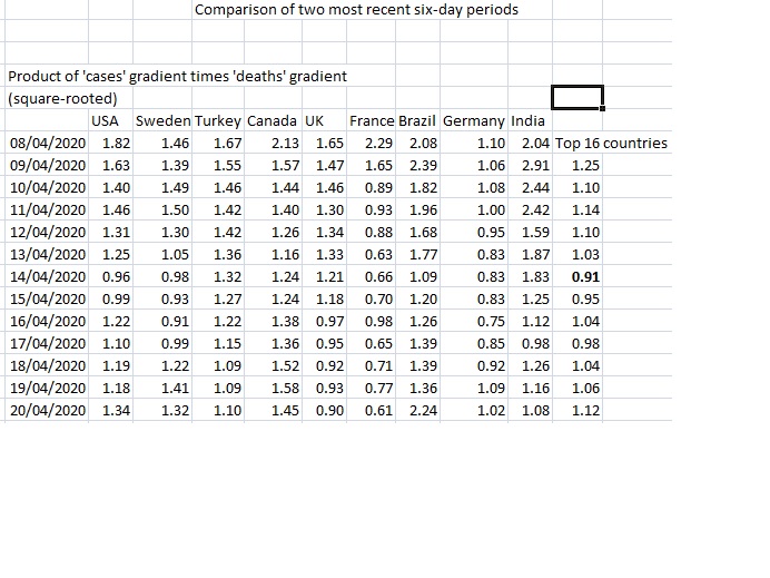
An update on some data I've been tracking (posted last week https://members5.boardhost.com/xxxxx/msg/1586907865.html)  As explained last time, the idea of all these gradients is that a ratio of greater than 1.0 crudely indicates that there has been acceleration in the rise, and a ratio of less than 1.0 is a slowing down (but if greater than 0, still an increase). The gradient is determined simply by comparing the most recent six-day period with the preceding one. The initial item of interest is the last column. Here I have multiplied the two gradients (cases, and deaths) together, and taken the square root. As an illustration, the US figure of 1.3 is striking as the US has the highest deaths and the figure had been below 1. The cases gradient of 1.2 suggests the US hasn't yet got a brake on the number of people catching the coronavirus. Six days ago when I last posted this data the case gradient was 0.8. I expect what is happening is that New York (together with the other main states contributing high number of cases) was and is getting control of its cases but the figures of other states that are on the rise are now having a more significant effect. Perhaps the US is just not like one country, more like Europe in this respect. The major Euro populations Spain, Italy, France and the UK (which dominated the European coronavirus tables) have products 1 or under; this could suggest daylight at the end of the tunnel, except that there is now pressure on the governments to lift the restrictive measures. Spain has cases gradient >1 but talking about slackening off slightly. Any second waves will obviously disrupt trends. Brazil looks a particular worry with it's big population and accelerating cases and deaths. Countries with smaller populations and smaller numbers of deaths but who have gradients bigger than 1 are probably worrying that they might only be a few weeks from critical situations as faced by the bigger countries. Etc etc. I also posted a table of recent trend data for countries I chose to follow. Here is an update on these countries  [img]http://[/img] [img]http://[/img] Again, I now use the square root of the 'cases gradient' times 'deaths gradient', so this table will look different from the one I posted last time but the interpretation of the product is the same; bigger than 1.0=acceleration, and less than 1=deceleration. Some countries have got below 1.0 but are now back over; like the US as noted. Sweden too, I understand it has had an interesting policy but I don't know enough to say more than that. In fact several countries over 1.0. The last column is a weighted average of a different group of countries - the top 16 (in terms of deaths). From below 1 six days ago it's now 1.3. The weighting is by number of cases, so some of this will be down to the US. It might look from this like the virus cases/ deaths are set to run away exponentially but I picked these countries as they were of concern. Other major populations (Spain, Italy) who got hold of their runaway data aren't in this table. Cheers |
| Message Thread:
|