- Re: Talking about content ... Archived Message
Posted by Tomski![]()
 on August 31, 2020, 3:49 pm, in reply to "Re: Talking about content ..."
|
Amazing that you are managing to write all this on the phone! Kudos. Sorry, I could not answer last night etc. since I fell off my perch just as I got to read your post. Just quickly from BMJ article this casts doubt about the 50,000 claim, thats all. Just in passing. I also expect 53 weeks may have been needed to correlate the data or show the scale. Not significant in my books. How can you ascertain from that graph that 50000 deaths from flu did not occur? You cannot, of course. Again, my main point is that these bouts of flu happening every year are regular, although they vary in intensity and exact timing during some years and this can be seen in the bumps like year 2010, week 2. Must have been a bad year for flu. 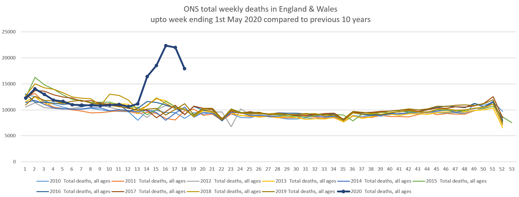 Again, my main point is that 2020 graph is exceptional in overall deaths increase, starting week 13. Its a massive jump. It is also relatively unusual in the timing i.e. beginning of March, by which time the flu season is more or less over. So, the excess overall deaths, as per the graph for 2020, are due to the effects of covid deaths and roughly 12,000 above what one would expect and that includes the flu season. Not sure if we are talking at cross purposes, you talking about flu (only?) and me talking about excess deaths in 2020, i.e. over and above the normal years which includes the flu deaths. Best |